I thought these graphs from Dr. Attia were interesting and to the point.
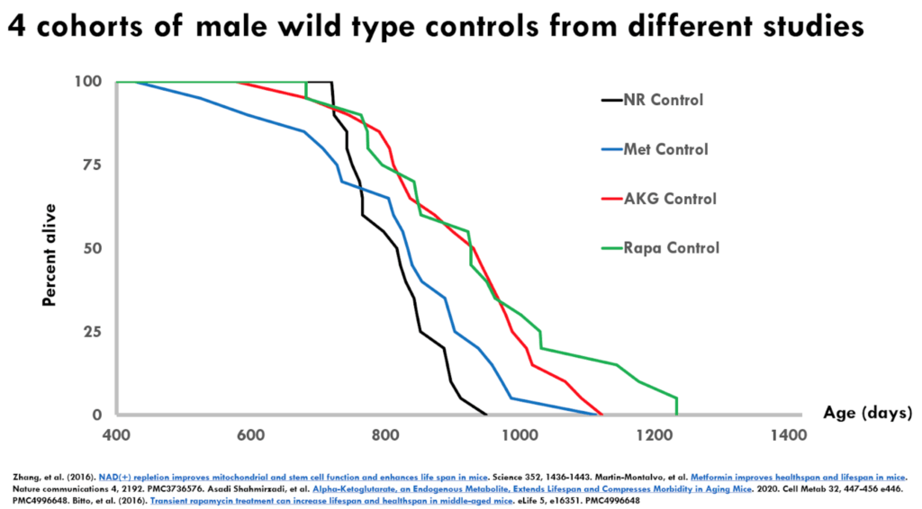
Figure 2. 4 controls with wild type controls from different studies.
This is a Kaplan-Meier survival curve—this is by definition, a monotonically reducing function because it is a cumulative incidence of death
- You can see on the X axis that it is showing you at 400 days is when they’re starting to keep track where 100% of the animals are alive
- With each passing day, there’s basically two options: That number stays the same or that number goes down, but it can never go up
- You can see these numbers all come down and eventually they cross the X axis at which point all of the animals in the respective control groups are dead
- You have four different lines representing four different studies
- There are all the male C57 black 6 mice
- The lines represent the wild type untreated controls from each of these studies
- This is just showing days from birth and the percent alive
Important point to understand : If everything worked perfectly, these curves should be identical because in principle they are genetically identical animals treated the same way all in pathogen-free conditions
- But what you see is that the curves are not on top of each other and in fact, they are pretty well spaced apart
- Note that something that is shifted to the right is typically thought to be extending lifespan so people will claim that their treatment extends lifespan if the survival curve is shifted to the right
- If we just were to look at these four curves, there would be statistically significant differences and very low P-values between the black and the blue being the shorter lived, and the red and the green being the longer lived, even though these should all be in principle the same
- Another point : Even though the blue and the red would share the same maximal lifespan, Peter says “I have to think that the blue and the red would differ statistically in a median lifespan shift. In other words, you could easily look at this and think the black is the control, the blue, the red and the green are three different lifespan extending strategies .”
- Not only that, but red and the green would be considered very large lifespan extensions for mice
Important point about the maximum and median lifespan extension:
- The stat that almost always gets presented is the median lifespan extension
- Another thing is that Matt doesn’t like the fact that the stat presented is always “percent” lifespan extension because it’s very susceptible to short lived controls
- When the denominator is smaller, the percent effect is going to be greater
- If you have a really, really short lived control, you can get a 30-40% increase in lifespan, that is pretty much meaningless because your control was so short lived
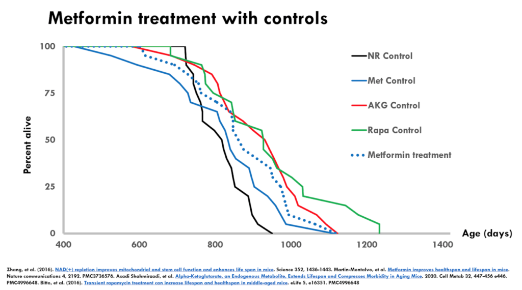
Figure 3. Metformin treatment with controls.
- In the figure above, we’re looking at the metformin treatment superimposed on all four controls–including the metformin control
- The dotted blue line is the metformin treatment and the control for this experiment is the solid blue line
- When you compare just the dotted blue line with the solid blue line, you will come to the conclusion that metformin increased median lifespan
- If you look at the average of the controls, you would suspect that metformin is no different than the average of the control
- Does that mean that metformin didn’t extend lifespan? ⇒ “No, I wouldn’t say that. But it also makes me concerned that this is not going to be a robust and reproducible effect because the treatment group in this case was actually shorter lived than some of the controls from other studies .”
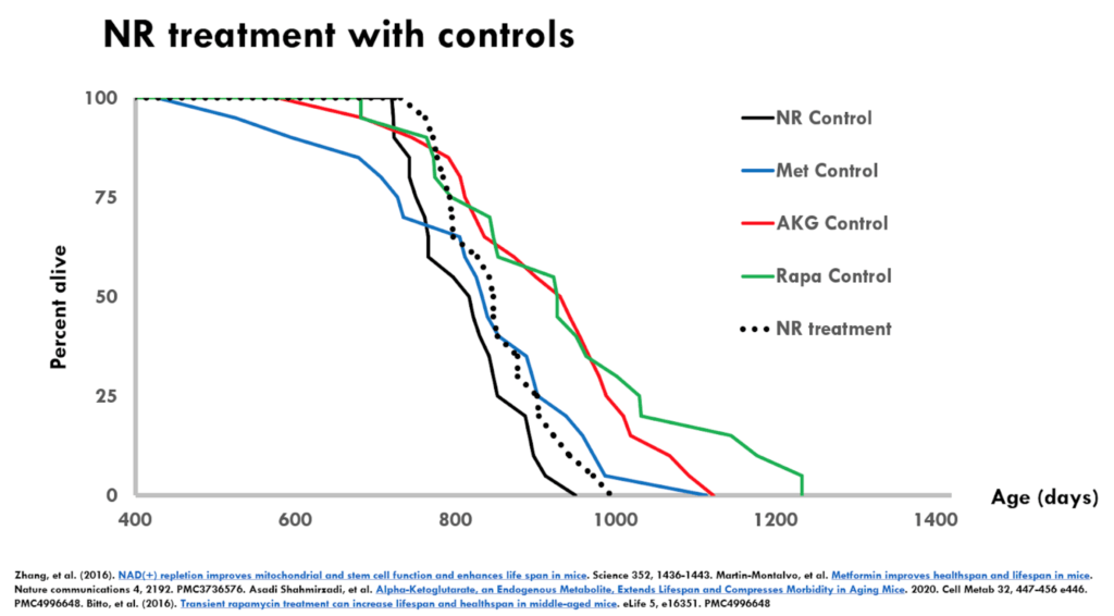
Figure 4. NR treatment with controls.
- The figure above is the nicotinamide riboside (NR) experiment
- The dotted black is the NR treatment group and the solid black is the control from that same experiment
- The results are almost an identical interpretation to metformin
- In this case, the treated group is even shorter lived than the metformin treated group
- It raises the same sorts of questions about the robustness and the reproducibility of this result.
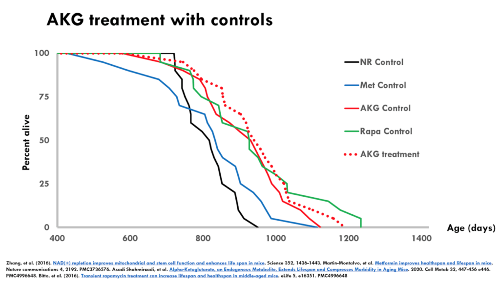
Figure 5. AKG treatment with controls.
- The figure above is the alpha-ketoglutarate experiment
- It’s an interesting example where the controls were pretty long lived
- The treatment has a even smaller effect relative to the experiment-matched controls than either metformin or NR
- But because the controls were so long lived, you might feel a little bit better about alpha-ketoglutarate in terms of effects on lifespan
- And certainly if you compare the effect of alpha-ketoglutarate to say the metformin control, there’s a huge effect there
- If this is the only data that we’ve got, there might be something there with alpha-ketoglutarate but we need additional data
Another point to make : We’re looking only at lifespan data
- Many of these papers have other measures that can strengthen the hypothesis that they are affecting the aging process
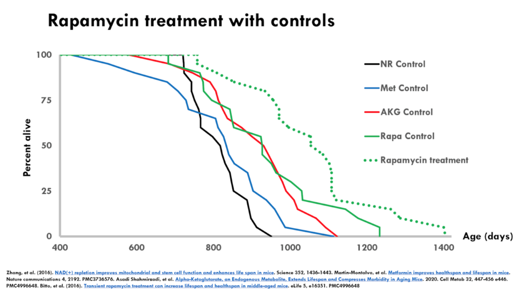
- This is a dose of rapamycin that had a large effect on survival
- The dotted green line (treatment group) is far to the right of the solid green (control group)
- This as a solid result because of the magnitude of the effect over long lived controls
- It’s even more interesting because rapamycin has been shown by many other labs to extend lifespan
- One of the interesting things about this particular comparison is the two interventions that supposedly extended lifespan with short lived controls, failed to show lifespan extension when they were independently tested by the interventions testing program (ITP with [NR](The Latest Data from the Interventions Testing Program: Nicotinamide Riboside has No Effect on Mouse Life Span – Fight Aging!, ITP with metformin)
From: